VSCO has been my favourite mobile app for over ten years
One of the only apps to stay on my home screen for over ten years is VSCO. The application is a staple of mobile photo editing with its minimal design, film-inspired filters and robust photo editing toolbox.
I use it all the time to edit for fun, and more frequently, I find myself bringing my professional work into the app to get a little extra flair out of my colours and contrast. Since 2011, it’s gone through numerous updates, but the modern VSCO still offers the fantastic editing tools that made it so popular in the first place, even if the rest of the app suffers from an overly simplified design and, perhaps, too many social features.
However, I still love it, and I’m excited to see the company is making moves to expand its tools to the web. But it’s not all roses as the app adds new subscriptions to balance the updated tools and new platform.
The ‘Starter’ tier — free
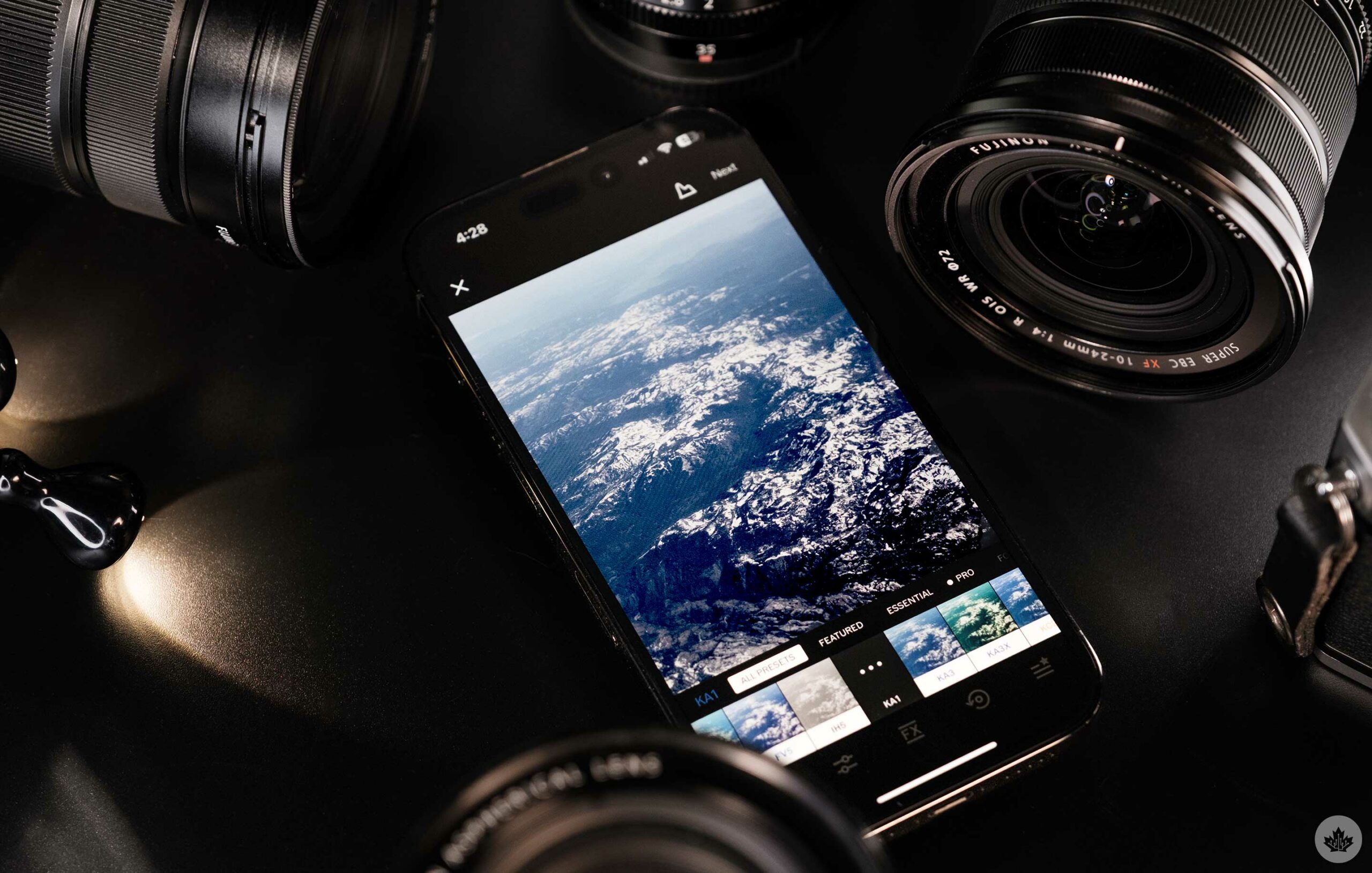
When you first download VSCO (iOS/Android), you can access standard editing tools, 15 legacy filters from the early 2010s and the basic social networking page. This aptly named starter pack is great for anyone new to photography, but the app is designed to show you all the features you’re missing, so you’ll likely see a filter or tool you’d rather have and want to upgrade fairly quickly.
I’m not a fan of the basic filters, but the editing program offers standard tools like exposure compensation, saturation, white balance and more. You can also create and save a single ‘Recipe.’ These are the custom filters you make in the app. However, advanced options like the HSL sliders are locked behind the ‘Plus’ subscription, so you won’t be able to make a very unique Recipe.
“not everyone has a VSCO profile, so it’s much more niche and focused on photography…”
When I first started using VSCO, this is what the app was like, and it’s a great place to learn basic editing. You get basic tools like exposure compensation, contrast and slightly more advanced sliders such as the split tone tool. Overall, it’s not set up for a professional, but if you’re someone who’s trying to get started, it’s a good jumping-off point.
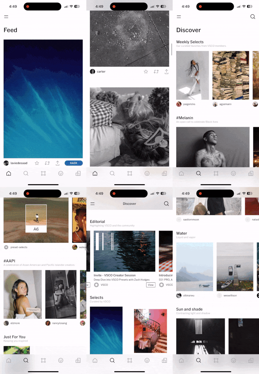
You can also access the VSCO feed, which lets you see photos from your friends and other photographers you follow. This section is pretty straightforward and acts a lot like Instagram. You look at pictures, and you can like or re-post them. VSCO pushes you to message the creator directly instead of making public comments which is a nice change of pace. This may sound boring, but compared to other social elements in the app, its straightforward nature is a breath of fresh air.
That said, not everyone has a VSCO profile, so it’s much more niche and focused on photography. To fill out your feed, you can use the ‘Discover’ section, denoted with a magnifying glass in the bottom menu bar. This lets you browse other people’s work, look at recommendations from the VSCO creative team and more. You can also find hashtags, live events and other photo-centric challenges here. It’s a nice area devoted to photographers, but I’ve never found myself fully absorbed in the app’s social aspects and instead tend to use it mainly as an editor.
The ‘Plus’ tier — $40 per year
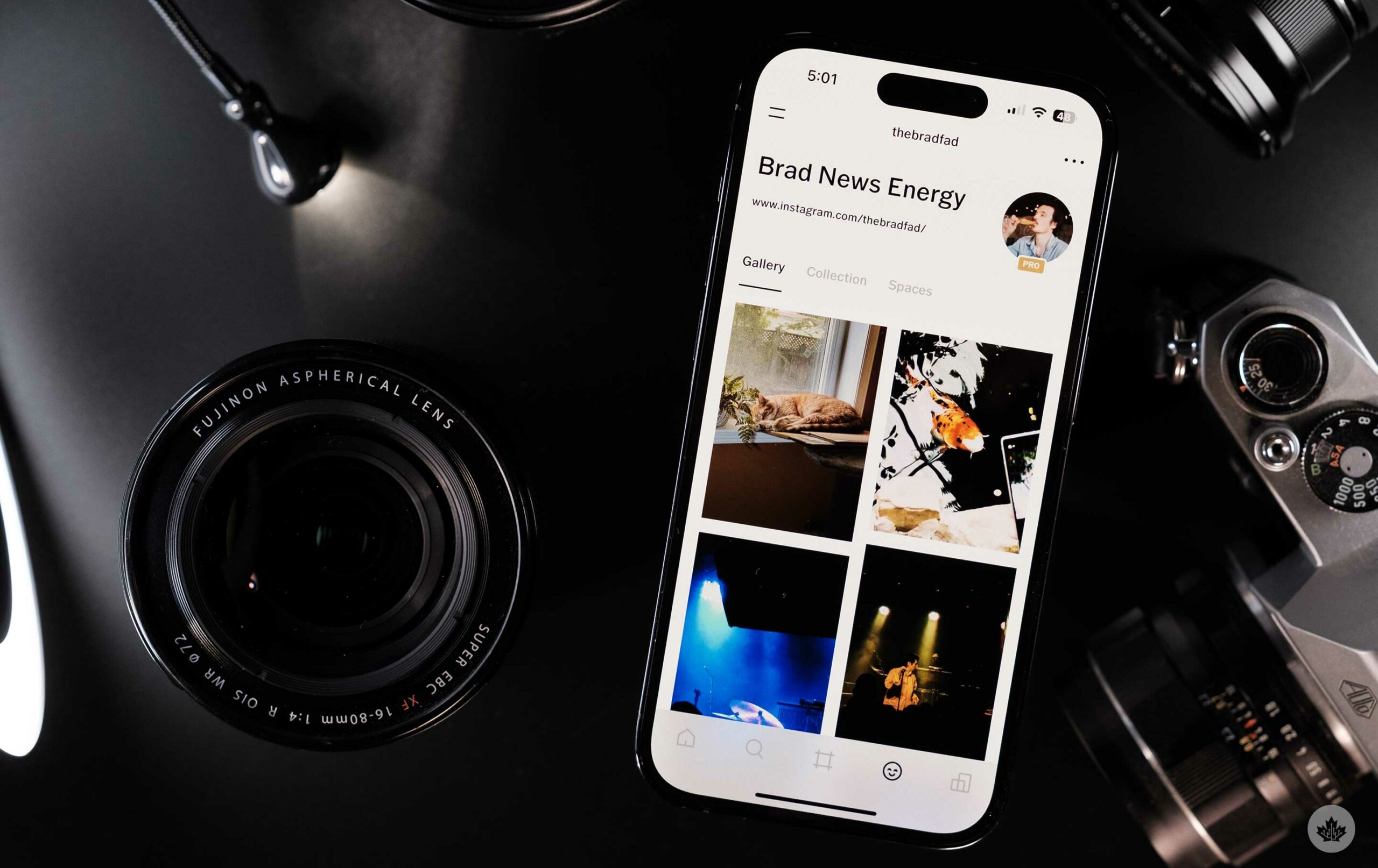
The standard option for VSCO members is the Plus tier. It unlocks 200+ filters, higher-end editing tools, the option to edit videos and more. This is the level I’ve been subscribed to since 2017, and I don’t think that’s going to change anytime soon. I find $40 around the maximum I’ll spend on an app subscription, and what VSCO offers feels like a good value for that amount of money.
The main reason I pay the yearly price is for the filters. I don’t always want to mess around with colours, and having an app filled with tons of film-inspired filters often gets me enough style. There have even been times when I’ve taken photos that I’ve edited in Lightroom from my Fujifilm mirrorless cameras and given them final colour edits in VSCO. It feels weird to edit high-end pictures on a phone or iPad, but over the years, I’ve fallen in love with the excellent vintage colour selection.
As I mentioned above, you can use Dodge & Burn tools to create rudimentary masks, and the HSL sliders allow you to control the distinct colours in an image. There’s also a spot removal tool that’s still in beta. It works on small spots but is nowhere near as powerful as Adobe’s apps. When I started to take photography more seriously, these tools were more than enough for me, but as I learn more about editing, I find myself tweaking the tone curves and creating masks in the mobile version of Lightroom since it’s much more precise. Then I take images into VSCO to colour and finalize.
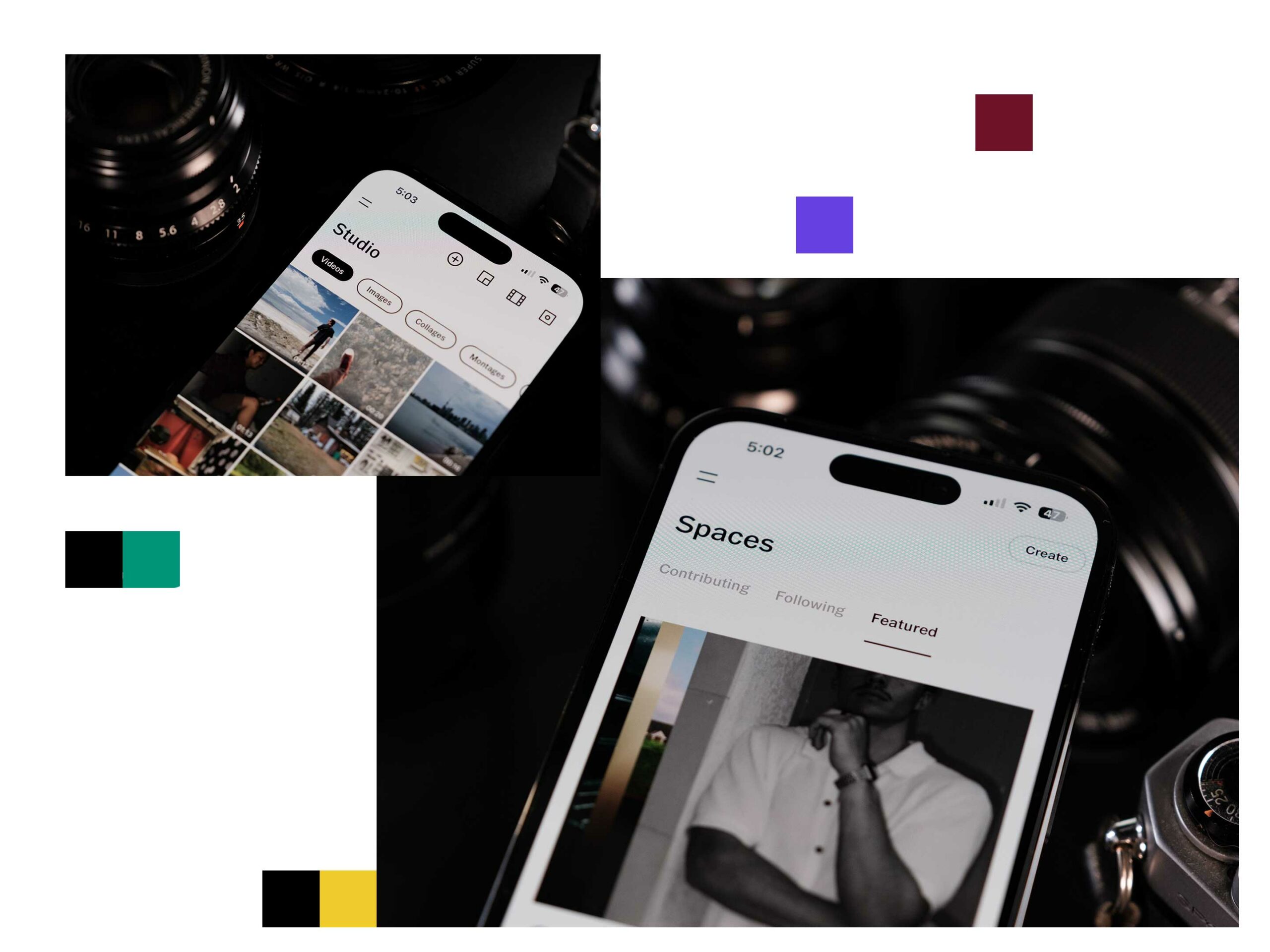
You can also edit videos or GIFs with VSCO Plus, but it’s not something I often do, but I could see short-form content creators getting a lot out of it. To be clear, you can’t edit videos together on a timeline, but instead, you can add colour, grain or other stylized effects to make it look vintage or unique.
“It’s nice to see a small app startup like Visual Supply Company grow into a fully-fledged corporation through the power of a perfect app.”
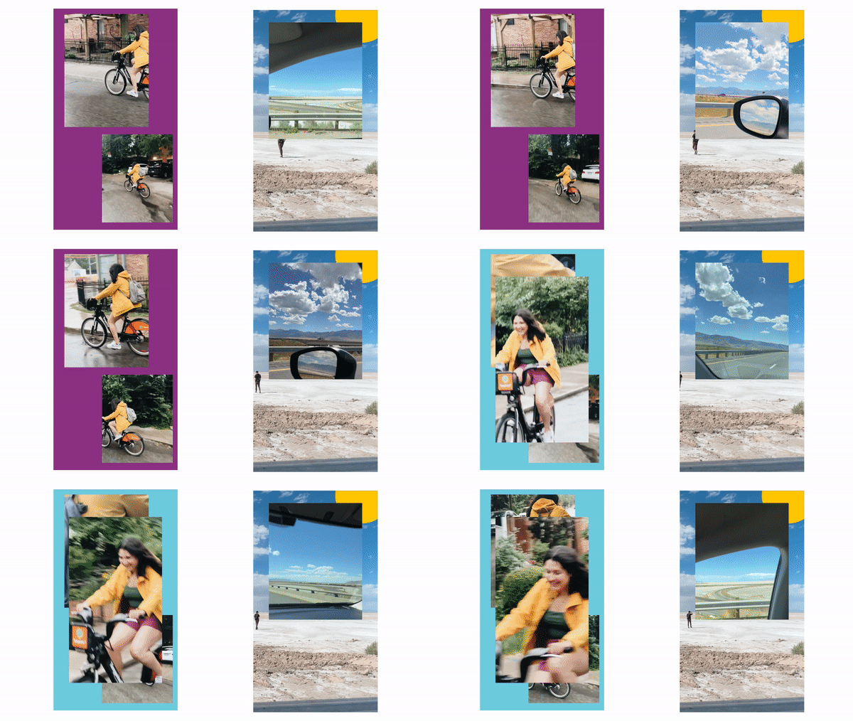
To further your creator skills, you can also edit videos into ‘Montages’ or photos into ‘Collages.’ This handy feature is buried in the app, but I often find myself using it to make Instagram Stories with more than one image or video on them. You can also create unlimited filter Recipes, and since you can actually use the HSL slider to make different colour combinations, this is worth doing.
Other features include online ‘Spaces.’ These are curated rooms with themes like ‘black and white portraits’ or ‘backcountry hiking.’ You can follow these rooms to see photos with a theme from various photographers or start your own. In a Space, there are comments for others who have joined to foster conversation on the shared images.
Like the other social aspects, these are fun to browse around, but since they’re in a completely different section of the app, it’s annoying to have to move around to find them. For years VSCO has been adding more and more social features, but the minimalist nature of the app makes it hard to figure out what’s important and why I should check back in every day.
The ‘Pro’ tier — $80 per year

VSCO’s newest option adds a few exciting features, but at $80 per year, it’s difficult to justify the cost. The best part of the new subscription is that you get access to the VSCO web beta. This version of the app runs on Chrome or Safari on Mac and Chrome or Edge on Windows and is attempting to bring the whole VSCO experience to the desktop.
For now, it’s mainly a filter repository with access to all the same colour profiles you get on your phone or tablet. The editing tools are still being added, and you can only adjust exposure, saturation and contrast as of the time of writing. However, in my tests, it worked well and adding VSCO colours to an image without pulling my phone out of my pocket is a nice treat. However, in its current state, it’s not worth the extra $40 per year.
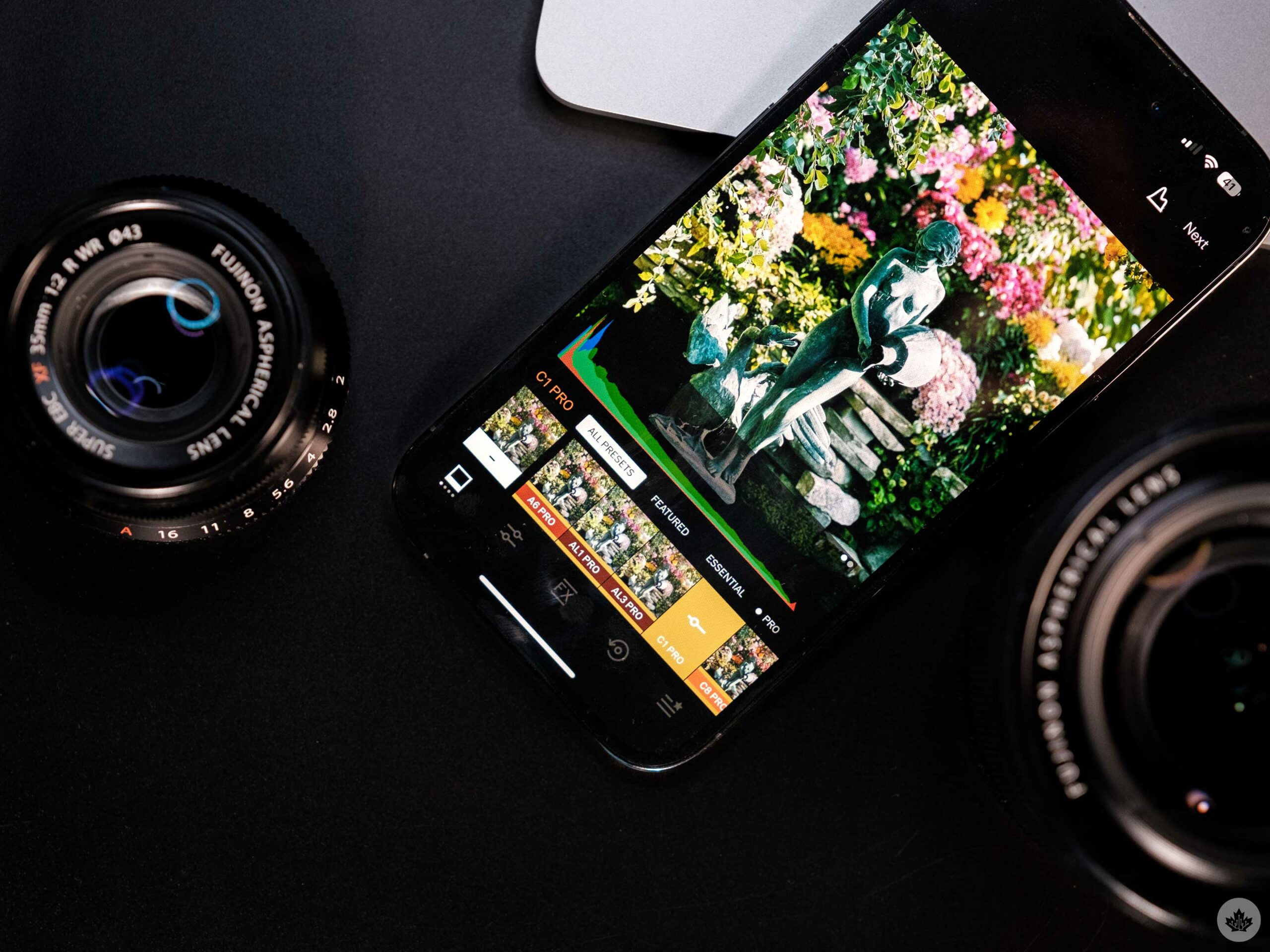
The other prominent feature is eight new filters with expanded controls for contrast, amount, colour and tone. These sliders are more specific to each filter to allow the user to dial in a look. For example, the new ‘SS1 PRO’ filter’s sliders adjust bright colours and tones while leaving skin tones and mild colours alone. In my testing, it’s very subtle, and you can achieve similar looks through more extensive edits and masks, but it’s handy and, when used correctly, can make an image really pop.
You also get a Pro tag on your profile, but the only real reason to sign up is for early access to the web beta and the new ‘Pro’ presets. That said, it might be worth waiting until more presets graduate to ‘Pro’ status, and the web beta gets more fleshed out. The web beta only launched in the summer of 2023, so it will likely need another year to finish, and the Pro filters seemed to get rolled out a few at a time every couple of months.
A proper app store success story
It’s nice to see a small app startup like Visual Supply Company grow into a fully-fledged corporation through the power of a perfect app. Along the way, the product has gotten a lot better, but the app is still highly minimalist to the point of being confusing, and there are a lot of random social features that don’t all seem to mesh into one cohesive space. Having said that, it’s still my favourite photo editor, and I can’t wait to see what filters get the Pro treatment next.
Still, I’ll be sticking with the $40 per year Plus plan since I’ve been nothing but satisfied with the current power VSCO offers. It’s not Adobe, but it’s not trying to be. As a company with a tighter focus on emulating vintage photography with fun colour sciences and minor edits, it’s perfect.
For all the latest Technology News Click Here
For the latest news and updates, follow us on Google News.

