Pictograms with universal design for equity and inclusion

Do you want to create a society through design where people with and without disabilities can live together as they are? Prof Mao Kudo of the Department of Media Design hopes that her research results are not just used to research further but that they become rooted in the fabric of society in transportation systems, and educational and public facilities. With her paper published in Visual Language, she set out to clarify the elements of graphic design in pictograms that make them easy for people with intellectual disabilities to understand.
People with intellectual disabilities rely on pictograms in public spaces to circumvent their difficulty understanding textual information. Pictograms in public places are support tools for receiving necessary information. There are efforts to standardize the JIS design of pictograms, but more surveys and feedback must be incorporated into the designs to make them more effective.
People with intellectual disabilities have difficulty learning or understanding the meaning of existing pictograms, so surveying elucidates which designs are more intuitively understood.
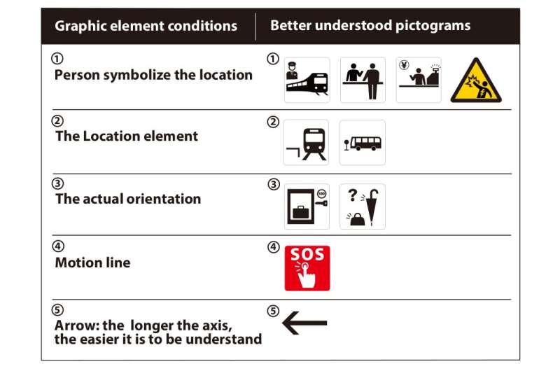
Through the study, Prof Kudo clarified five design elements that are factors in increasing pictogram comprehension.
- Adding a person to symbolize the location: adding a person asking another person questions instead of “i” symbol for “information.”
- The location element: adding the platform for the train station and the bus stop pole for the bus stop.
- The actual orientation: show items as they are oriented in real life, key, and locker in their actual orientation.
- Motion line: adding three little lines to represent movement or sound.
- Arrow: the longer the axis, the easier it is to understand. (1.9 times the length of the standard pictogram)
Although the graphic elements that increase the comprehension of pictograms were elucidated, they did not apply to every circumstance. For example, there were some IQ groups (21 to 35 versus the 36 to 50) that were found to differ in their preference of pictograms as the position and directions of “stand in two lines” and “please stand on the right or left.” Further investigation into the conditions of the pictograms is needed.
For example, the addition of the motion line was effective in increasing the understanding of the emergency button by (p<.05 but="" for="" stand="" on="" the="" right="" or="" left="" it="" had="" no="" effect.="" prof="" kudo="" could="" only="" speculate="" based="" her="" prior="" experience="" teaching="" at="" special="" needs="" schools="" as="" to="" what="" elements="" target="" pictogram="" that="" caused="" different="" outcomes.="" she="" wonders="" perhaps="" is="" not="" very="" meaningless="" add="" effective="" graphic="" if="" object="" itself="" drawn="" with="" abstract="" expression.="" hopes="" investigate="" this="" further.="" wp_automatic_readability="42.287872841444">Interestingly, both people with and without intellectual disabilities had similar results with motion lines. The study also found that the longer the axis was for the arrows, the easier it was for people regardless of their disability status. This is important, that pictograms are understood by people with or without disabilities.
It seems obvious, but it had not been clarified before that the same graphic elements have different effects depending on the subject. In addition, Prof Kudo had only been able to answer the question of what elements of the target pictograms are responsible for the different effects.

When Prof Kudo began working on this issue during her doctoral program, she was asked, “Why are you researching pictograms when they are already complete?” However, as the research progressed, she found that people with and without disabilities both found the standardized, commonly observed pictograms challenging to understand.
Furthermore, they both found the addition of a graphic element for context made it easier to understand the pictogram. Even when we think we have “perfected” the existing pictogram, we may have a bias of assumption. Rather than traveling far to discover the unknown, sometimes new findings can be made by approaching familiar things from a different perspective.
Also, pictograms generally function in a particular environment as part of a sign. Still, it is not clear how people with disabilities perceive and interpret symbols and pictograms in the general environment.
While it is essential to study and progress the design, it is even more important to know how people who use and see them perceive them, and this seems to shake up the design itself. Prof Kudo would like to work on this point for future studies. She hopes you will contact her if you too are interested in creating a society where people with and without disabilities can live together as they are.
More information:
Publication: journals.uc.edu/index.php/vl/article/view/6395
Provided by
Kyushu University
Citation:
Pictograms with universal design for equity and inclusion (2023, April 26)
retrieved 27 April 2023
from https://phys.org/news/2023-04-pictograms-universal-equity-inclusion.html
This document is subject to copyright. Apart from any fair dealing for the purpose of private study or research, no
part may be reproduced without the written permission. The content is provided for information purposes only.
For all the latest Science News Click Here
For the latest news and updates, follow us on Google News.

