iPhone 13, Galaxy S22 Ultra, and Pixel 6: new designs or blasts from the past?
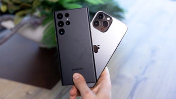
Over the years, we’ve seen the smartphone industry blossom with new ideas, designs, and features. From the revolutionary first iPhone to the rise of Android phones, and Microsoft’s Nokia disaster, there have been ups and downs all around.
But it was never only about software and specs. Smartphone design has changed tremendously, to the point where all brands make similar-looking devices with very similar specs. So what do these brands do to distinguish their new models each year?
We can separate the phone brands into two sections – those that set the trends, and those that follow. Apple and Samsung are two brands that often set the trends, while other brands like Xiaomi and Motorola simply stick to what works (most of the time).
However, it seems like smartphones get fewer and fewer design changes each year. This is probably because the current smartphone form factor is pretty much flawless, so design changes are mostly due to pure aesthetics and marketing, not so much for functionality and innovation purposes.
This is where things get tough for designers. There’s a trend that’s been going on for a couple of years now, and I’m going to call it ‘a blast from the past’. When a smartphone brand runs out of ideas, it opens its big phone archive and looks at its past designs. The brand looks for iconic, distinguishable design elements that have worked and people loved before.
What the industry made Apple do
Of course, the purpose of the idea of bringing back an old design element is not only for the phone to have a less-risky design, but also to bring a certain element of nostalgia, which almost always works for customers.
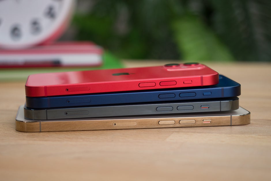
That’s what Apple did with the iPhone 12 series. The Cupertino company spent years making phones with rounded edges and soft, curved sides. But guess what happened? Everyone started choosing the same type of design, so it needed to come with something new.
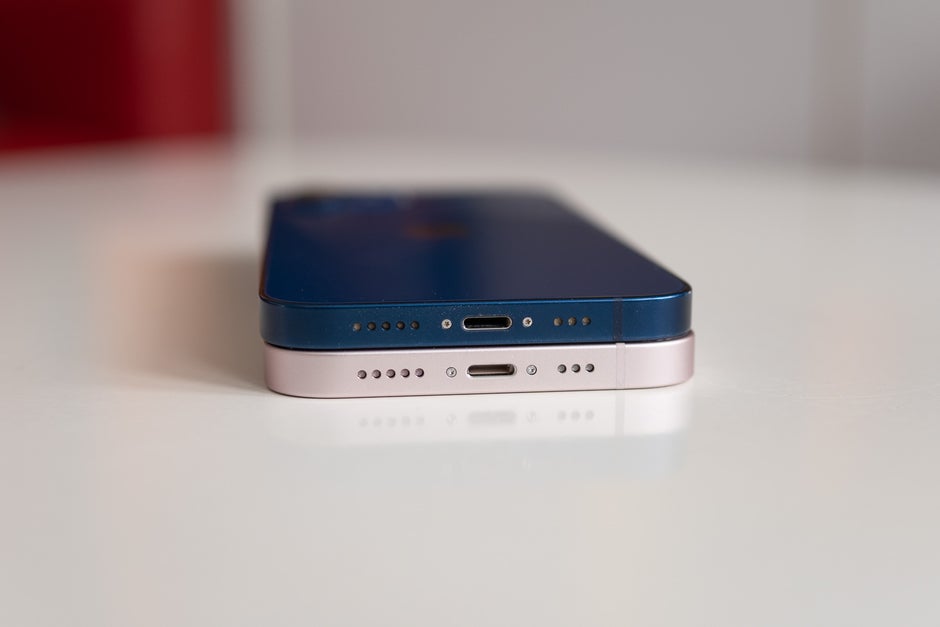
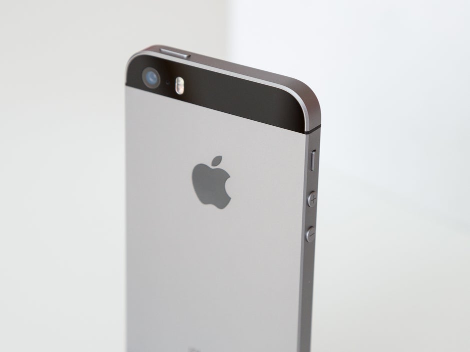
Well, the future turns out to be the good old past. The iPhone 12 made waves with its frame design that was pretty much borrowed from the iPhone 4. A smartphone that made its debut back in 2010.
And this isn’t the first time Apple has done that. The basic 10.2-inch iPad closely resembles Apple’s iPad 2 design and has been left unchanged for years. This makes the device a classic and also saves the Cupertino company tons of money, increasing its profits.
Both iPhone SE models were also with an old design, featuring modern hardware, slashing down the price and catching those types of users who like familiar tech. Trust me, there are more of those than you think, especially among older generations.
So in the end Apple did it, and others started to take note. Is the future of smartphone design actually its past?
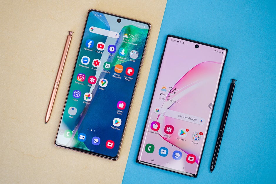
The Samsung Galaxy S22 Ultra… is pretty much the Galaxy Note 10
Okay, I know calling Samsung’s latest ultra-premium flagship a phone from 2019 is pretty controversial, but hear me out.
In terms of specs, of course, the new Galaxy S22 Ultra is one of the best on the market and much superior to any Galaxy Note phone from before. But still, one has to look at things objectively.
When talking about design, the Galaxy S22 Ultra looks much more like a Galaxy Note phone than a Galaxy S one. Samsung’s Galaxy S series has always had a rounder, smaller, and user-friendly design. It was always the phone for the masses, while the Galaxy Note was the phone for professionals and tech enthusiasts.
Now that Samsung has ditched its Note line, it decided to go and just replace it with the Ultra branding. Is that wrong? Of course not. But is it a brand new design? No, it definitely isn’t.
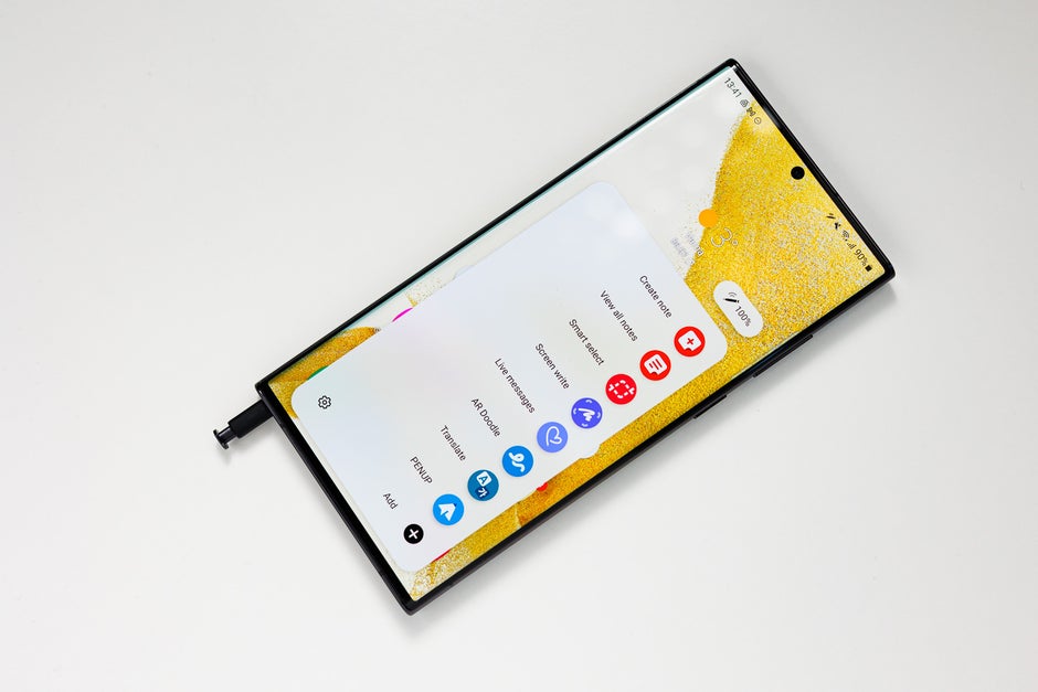
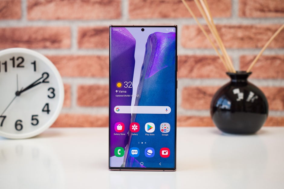
See, the Galaxy S22 Ultra has the same sharp corners, sleek slim-looking design, curved display, small camera bump, and built-in S-Pen like the Galaxy Note 10 and Note 20 series.
If you didn’t know its model name and saw the Samsung branding, one could easily mistake it for a Galaxy Note. This is yet another way of improving on an existing design and giving people a nostalgic, familiar look.
It is also easier and cheaper to upgrade an existing design rather than create a new one from scratch.
You have two new Galaxy S phones, and that’s great. But what is that Galaxy Note doing there and why do they brand it as the S22 Ultra? See my point yet?
Time will tell if this new further separating of the Ultra model will work, but now when you think about the Galaxy S22 you are presented with two almost identical phones and one that looks like it’s been adopted from the Galaxy Note family and doesn’t seem to fit.
Apple also has regular and Pro iPhones, but they look like siblings, rather than distant cousins.
Google bringing back the nostalgia
Google was never a big seller of smartphones. It had successes here and there, but it relied for too long on other established manufacturers to design its phones and treated them as devices made with the only purpose to showcase its new Android versions.
Of course, Google decided to put an end to that marketing strategy and go hand in hand with the big boys. In 2016 the company replaced its Nexus series with the new Pixel series.
The OG Pixels strived to be the iPhone killer. Phones with great software experience, OS upgrades for years, premium design, and top-notch specs. But there was a problem.
See, the Google Nexus phones were popular for being affordable and offering one of the best value for money in the industry. The Pixel killed this model off with its iPhone-like pricing. And while the phones were pretty good, they weren’t a major upgrade over the iPhones of the time.
Of course, Google is pretty stubborn. It also has plenty of money to spend on developing devices that don’t really sell all that well. So Google followed with a new generation of Pixel phones each year. And each year the excitement for the Pixel was fading away more and more, after every disappointing model.
The company decided to take drastic measures and try and break ground in the market it once had success in, the mid-range class. The Pixel 3a phones were a much more affordable Pixel alternative with good specs and great camera performance. But Google’s dream of making the ultimate flagship smartphone was still unrealized.
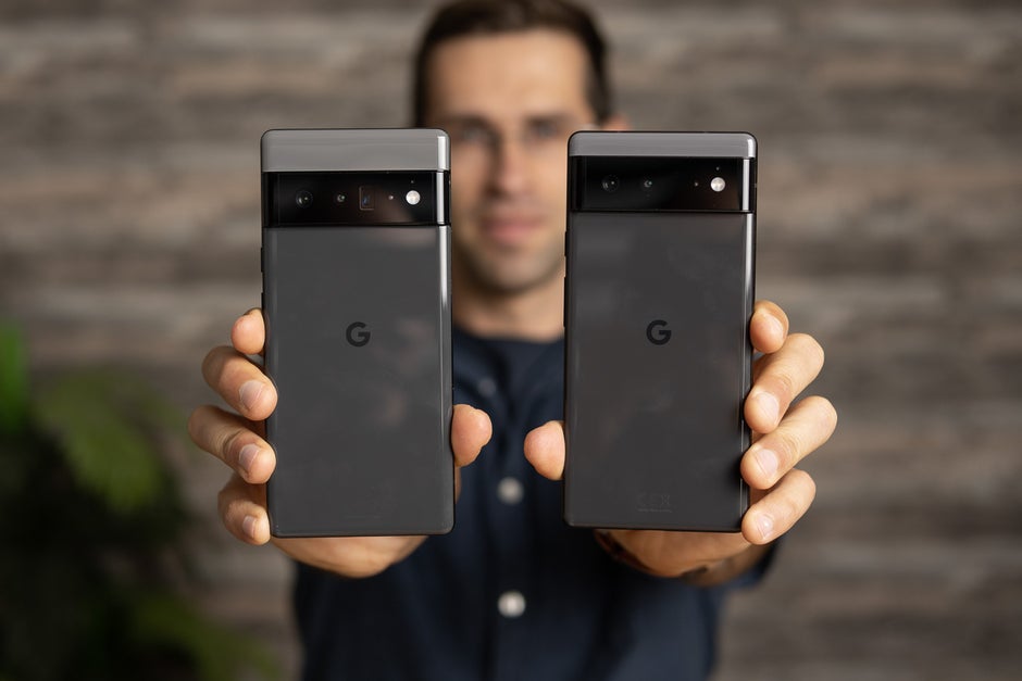
At the end of 2021, Google seemed to be finally taking things seriously with the release of its new Pixel 6 series. The new phones packed the company’s first in-house designed processor, excellent camera systems, flashy new design, and good value for money.
You might be wondering at this point why I had to go so in-depth in Google’s device history to make my point. Well, doesn’t the Pixel 6 look… familiar? Because to me, it does.
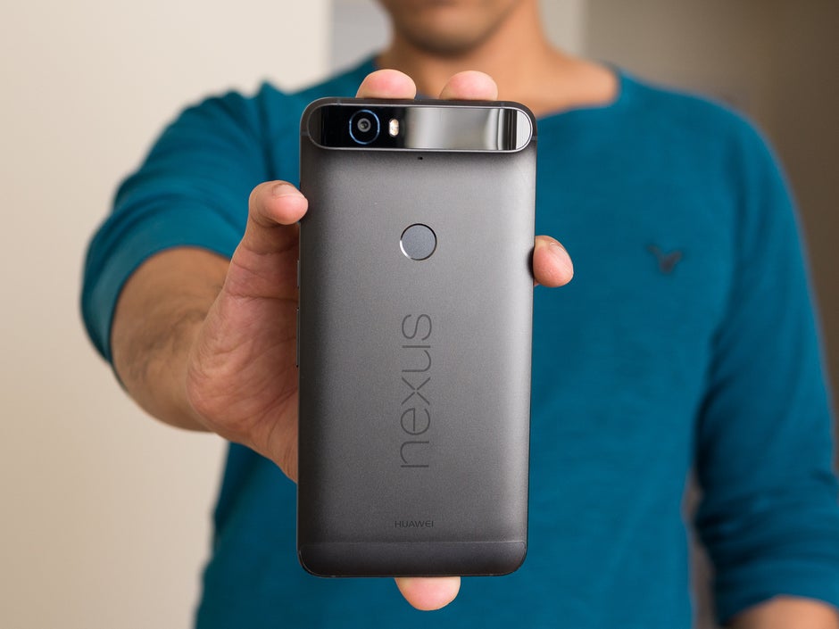
See, the Pixel 6 phones have a camera-module design that looks strikingly similar to a phone released seven years earlier, the Google Nexus 6P. I don’t know if the phones’ coinciding names are what inspired Google designers to take on an old phone’s design, but it sure is a good theory.
The Google Nexus 6P was the only Huawei-made Nexus. It was a fan-favorite for its flagship specs, premium design, and unique-looking camera-module.
When announcing the Pixel 6 series, Google never mentioned its design is inspired by an older device. Instead, it bragged about how different and innovative it is.
But in the end, this is another case of ‘a blast from the past’. The Pixel 6 reminds us of one of the last great Nexus phones, just like the iPhone 12 and 13 remind us of the iPhone 4.
People seem to love the Pixel 6’s camera module, and maybe it’s exactly because of its nostalgic feel.
Time is ticking
In conclusion, I must say that borrowing an old but iconic design is a genius idea. It brings nostalgia, makes the phone instantly recognizable, and even saves on design costs.
The smartphone industry needed a bit of a change when it comes to looks, as things have become pretty haptic in the late 2010s, and now we have it. Trendsetters will always set the trends, followers will always follow.
But time is ticking. While this strategy of improving on an old recognizable design element and implementing it in the newest phones is genius, there are only so many iconic designs one has had in its past.
While it might seem like smartphones have been around forever, in actuality, it’s been less than two decades, and not many phone models have gained global popularity during this time.
The iPhone 4, the Galaxy Note 10 and 20, and the Nexus 6P are iconic devices, but they are part of a pretty small and elite club, the club of classic smartphones. And time is ticking, as there are only so many iconic retro designs one can reuse, so this trend’s days are pretty much counted. The industry needs something new, fast.
For all the latest Technology News Click Here
For the latest news and updates, follow us on Google News.


