iOS 15 Safari redesign: former Google designer explains why Google tried a similar thing and abandoned it

The iOS 15 beta version will introduce many interesting new features to iPhones, and a redesign of the default Safari browser seems to be one of them. However, such a redesign has been attempted by Google in the past for its Chrome browser. Now, Chris Lee, a former Google staff interaction designer, has shared some insight on that design, why Google attempted it and why it wasn’t successful, reports 9to5Google.
Safari’s new design with iOS 15 beta is similar to what Google tried with Chrome
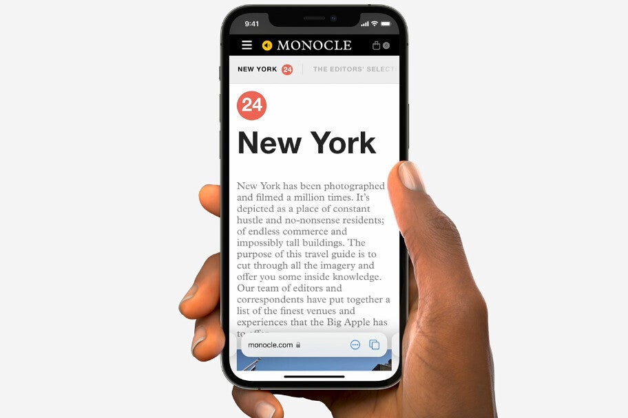
The redesign of Safari in iOS 15 is what Apple calls a “new tab bar design” and with it, the address field and other key actions are placed at the bottom of the screen, just above the system gesture navigation bar.

Safari gets redesigned in iOS 15 beta
It provides you with more screen space for scrolling and browsing and is easily reachable. Additionally, it allows you to jump between open tabs by swiping.
On the other hand, Google attempted such a design in a project called “Chome Home” in 2016. Chris Lee has described it as an ambitious redesign of Chrome for mobile.
It was pretty much similar to what Apple is currently doing: Chrome’s toolbar was to be moved to the bottom of the screen, into a panel that reveals additional functions when swiped up. A swipe up was to show users a bottom bar with four sections: Discover, Downloads, Bookmarks, and History. Chris Lee stated he had created the design because of the need for better accessibility of features and because of the growing sizes of phone screens.
Upon testing the new feature, Google received mixed reactions. Lee then subsequently decided the new feature will not be helpful to all the users and advocated for the project to be stopped. The thing is, many users had reported finding the new design disorienting. More specifically, tech-oriented users found it great, but mainstream users were not comfortable with it and found it disorienting.
Given the fact Chrome serves many users globally and with varying levels of tech literacy, Lee became convinced Chrome Home will not be as helpful to everyone as he initially thought.
Do you think the same will happen with Safari’s redesign? Would you find the new Safari change helpful or confusing? Tell us in the comments below!
For all the latest Technology News Click Here
For the latest news and updates, follow us on Google News.


