I’m in a love-hate relationship with the iPhone 14 Pro’s always-on display
Dhruv Bhutani / Android Authority
Ever since Samsung introduced the always-on display on 2016’s Galaxy S7, the feature has made its way to practically every Android phone with an OLED display and some without. Today, an ambient display is virtually taken for granted. Some might even say that the absence of an always-on mode is more notable than its presence.
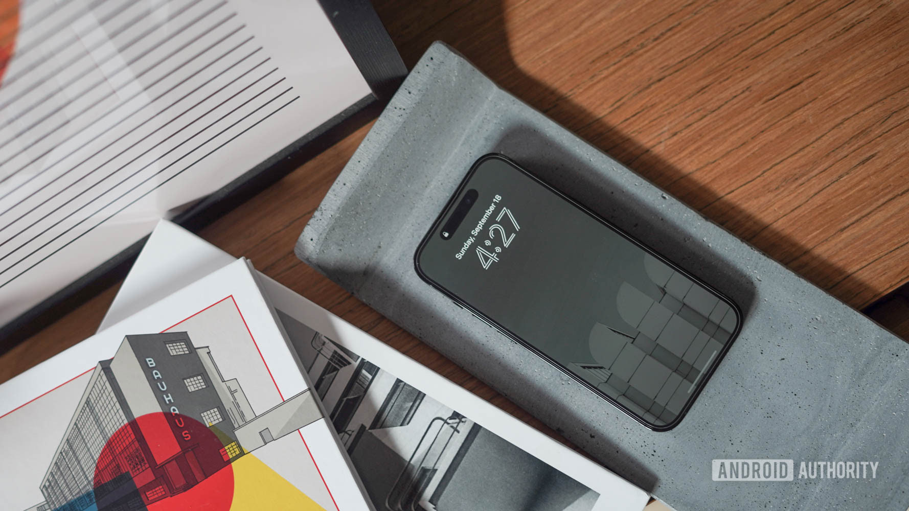
This year, amidst a blitz of marketing hyperbole, Apple finally introduced the long-awaited feature on the iPhone 14 Pro. In typical Apple fashion, not only is it another exclusive to Pro users but it also takes a diametrically different approach to Android devices. So, what’s different? Apple took the word always-on display to heart; its implementation of ambient mode quite literally has the lock screen turned permanently on — just slightly dimmer.
It took a while for Apple to introduce an always-on display, but it’s here and not what you might expect.
As is the case after every new launch, the feature addition and its implementation have resulted in a fair amount of debate from both sides of the smartphone camp. While Apple users extoll the benefits of having your display permanently visible, Android users are not too impressed. So which is it? I swapped my SIM card from my Samsung Galaxy S22 Ultra to the always-on display-equipped Apple iPhone 14 Pro for about a week, and here’s what I think.
Always-on display: Who does it better?
112 votes
Incredibly stunning, surprisingly distracting

Dhruv Bhutani / Android Authority
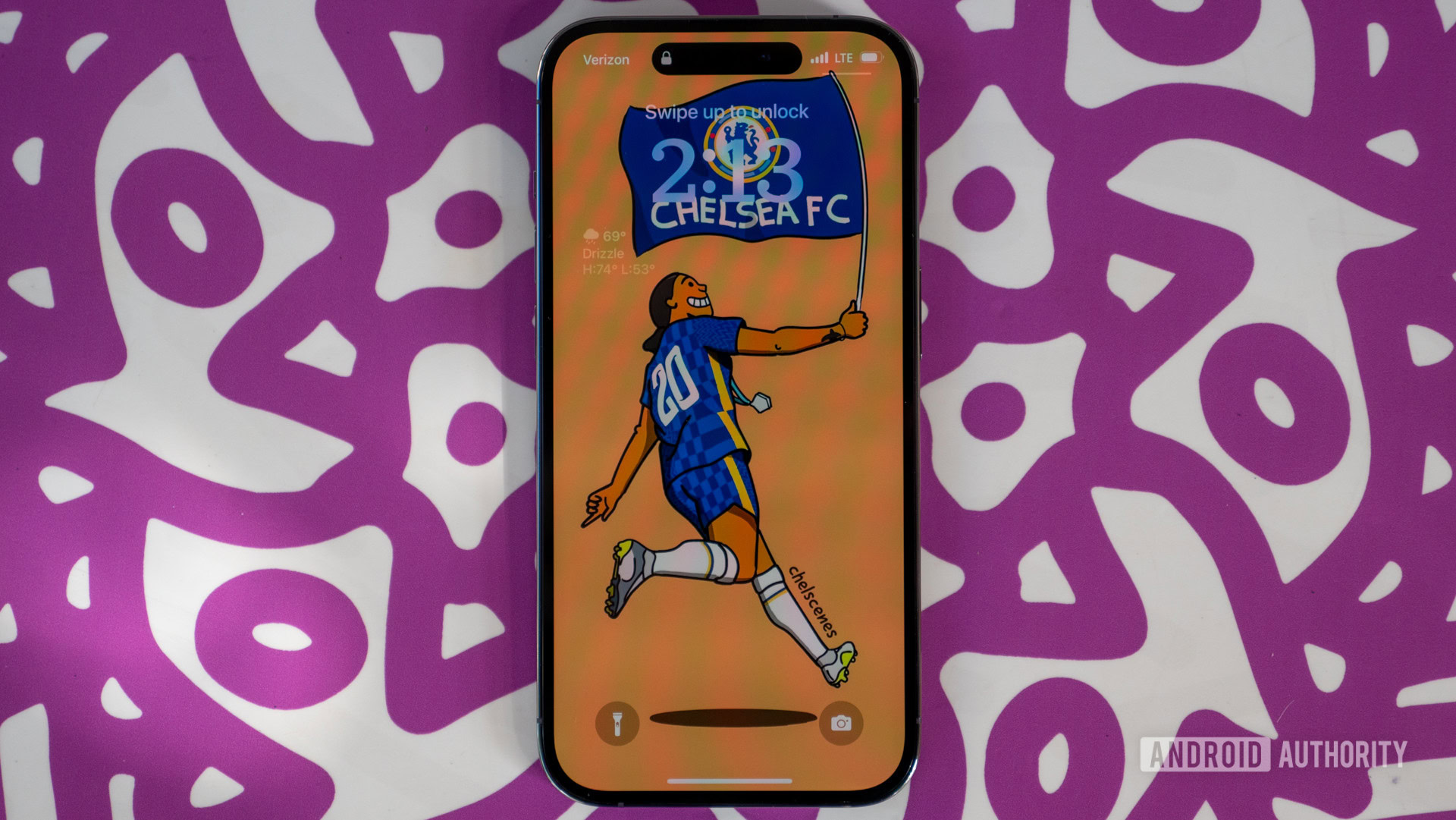
First, the positives. Remember that beautiful wallpaper you carefully selected while setting up your phone and barely glanced at again? With the iPhone 14 Pro, your wallpaper takes center stage and always remains visible. Any widgets added to the upgraded iOS 16 lock screen are also perpetually visible.
Some ideas: The ten best background and wallpaper apps
The lock screen is not static either, and widgets like timers or weather alerts continue to update in real-time, albeit at a lower refresh rate. I could see a quality calendar or to-do widget on the always-on display replacing the sticky note on my desk.

Dhruv Bhutani / Android Authority
But that’s where the positives end; Apple’s always-on display experience is incredibly distracting. As a journalist, I receive an astounding number of emails and WhatsApp pitches daily. It can be pretty hard to ignore updates when there’s a bright animation on your desk every few minutes. The problem gets worse with the iPhone’s stack of notifications constantly glaring at you in the face. When it comes time to focus, there’s no other option but to flip the iPhone over. Android phones do it much better with a simple icon denoting unread messages or emails. Yes, there’s a pop-up notification, but it gently slides away instead of screaming “look at me.”
The iPhone 14 Pro’s always-on display could easily double up as a night lamp.
However, it gets worse when it comes time to call it a night. The always-on display, indeed, remains always-on even at night and is bright enough to serve as a night lamp on your desk. Moreover, every notification you receive blasts out a retina-searing beam of room-illuminating light from that 2000-nit display Apple is so keen to advertise.
Switch off: The ten best digital wellbeing apps for Android
Is there a way to switch off this behavior? Sure there is. Apple expects you to use the scheduled Sleep focus mode to turn off the always-on display at night. This would work great if you live a strictly regimented life. However, not everyone follows a fixed nighttime schedule, and it’s just one more example of Apple expecting you to conform your life and smartphone use around its features rather than the other way around.
It’s the Apple way or the highway
There’s also the small matter of customization. The ambient mode feature is clearly designed to showcase the updated lock screen in iOS 16. With support for lock screen widgets, Apple has made a big deal of highlighting the stunningly designed lock screen page. It isn’t surprising that Apple wants those fancy widgets always accessible so they remain glanceable even when you are not actively engaging with the phone. That said, the customization options are a pittance compared to what Android phones offer.

Dhruv Bhutani / Android Authority
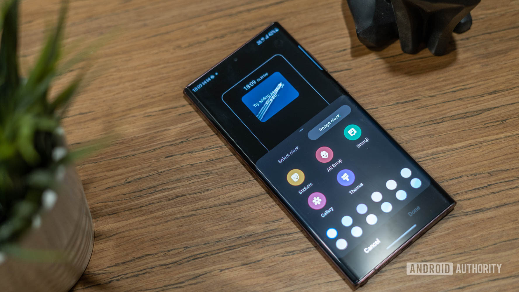
I can customize clock styles on my Samsung phone for the always-on display, set custom colors, or even add a playful animation or image. The iPhone offers none of that. Samsung will even let you set up custom schedules for the always-on display or allow you to switch it on only when receiving new notifications. OnePlus and Oppo phones go a step further with many personalization options, including custom animations and text messages. iPhones have never been the home for those who prefer to make their phone their own through deep customization, but a single toggle switch to turn the display on or off is just too little.
I love how Apple’s always-on display looks, but there’s no doubt in my mind that Android does it better
Finally, there’s also the matter of battery consumption from this comparatively bright always-on display. Apple says that dropping the screen to 1Hz drastically reduces battery consumption. In my testing, that has been true, and I’ve seen a delta of about 5% at max between keeping the always-on display switched on or off. However, you can’t beat physics, and a smaller number of lit pixels will always consume less battery life, and those numbers do add up.
An unfortunate case of aesthetics trumping practicality

Ryan Haines / Android Authority
Look, I totally get what Apple is reaching for here. The company built a well-thought-out and, frankly, gorgeous-looking lock screen experience in iOS 16, and it makes sense to showcase that all the time. However, this is one instance where practicality trumps aesthetics, and Apple can’t expect all users to conform to the Cupertino way. I shouldn’t have to resort to an all-black wallpaper to peep at the time and notifications on my phone. I love how the always-on display looks on the iPhone 14 Pro, but there’s no doubt in my mind that Android does it better.
For all the latest Technology News Click Here
For the latest news and updates, follow us on Google News.

