I love Android, but I prefer it more on tablets than phones
Rita El Khoury / Android Authority
Although I knew that Android on tablets has come a long way in the past couple of years, I didn’t expect to fall in love with it so much that I’d think it’s better than Android on phones. But that’s exactly what happened when I started using the Pixel Tablet. Looking past the Pixel aspect of this particular tablet, Android as a whole feels more polished on larger screens now. Not just compared to a couple of years ago (which, ha, did that even count?), but also compared to the same modern experience on Android phones.
I know that may be a bit controversial to say, especially considering Android’s fraught history with tablets, but hear me out. Everything I want to do on my phone is simpler, smoother, and better on tablets. Yes, obviously, it’s the larger screen factor, but it’s also how Android has adapted to it.
What do you think of Android on tablets?
379 votes
Google apps look and work better on large screens

Rita El Khoury / Android Authority
It took Google more than a decade to dedicate some development resources to larger screens, but we finally have a decent portfolio of first-party apps on tablets and foldable phones. And they are a joy to use.
The simplest example is Chrome, which shows you open tabs in a single row as it would on a desktop. I can switch to another tab in one tap, no need to reveal the grid first. It’s one saved tap, sure, but it all adds up over hours and weeks of usage. I’d still love to see the full desktop Chrome experience on tablets — rendering, extensions, search engines, and all that — but this one minor change is already an improvement over the phone experience.
Nothing comes close to the upgrade Google Photos received from phones to tablets.
If we’re talking about pure efficiency gains, though, nothing comes close to the upgrade Google Photos received from phones to tablets. Besides how easy it is to go to the local “On Device” folder or check the archive and trash from the side panel, it’s the photo editing experience that’s massively improved. More screen estate means more tools are visible at the same time, including all the editing sliders. I don’t need to tap on Brightness, adjust it, tap Done, tap on Highlights, adjust it, tap Done, and so on. You get the idea. Everything is adjustable from the same screen; it’s just incomparable.
Other examples include the ability to see my schedule and an event’s details at the same time in Calendar, accessing many more smart home devices on the same screen in Google Home, viewing both my inbox and an email’s content in Gmail, browsing folders and files at the same time in Files, checking the weather forecast for the next 10 days in the same view, and literally any screen in Google Maps.
Many third-party apps are better too
Rita El Khoury / Android Authority
Not every Android app has been optimized for the tablet experience, and not every developer has properly thought of all the ways they can adapt their app’s interface to a larger screen. Of those that did, some took the lazy way out by scaling their apps up, like Asana, Slack, Amazon, or Pocket Casts. Others did their homework.
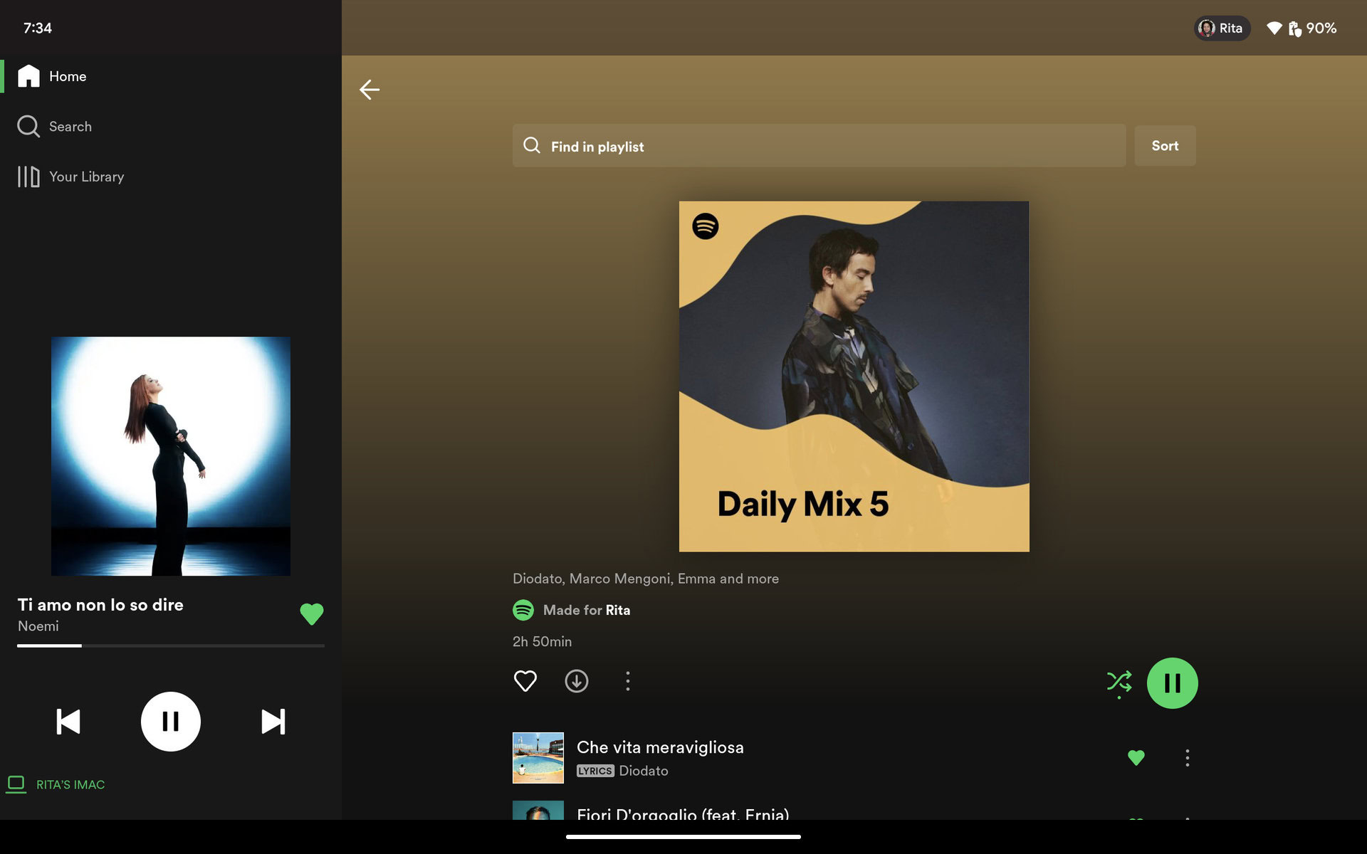
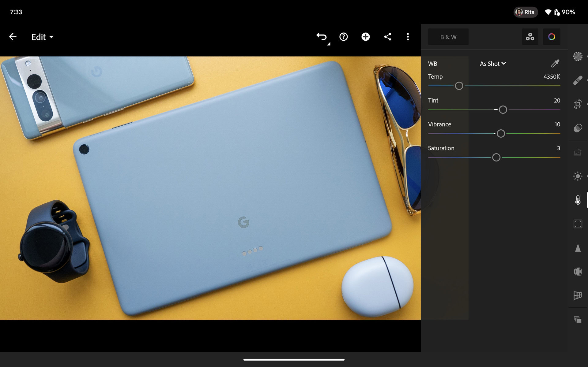
Todoist shows me all my projects and labels in the side panel, Adobe Lightroom moves all the controls to the right side just as it does on the desktop, WhatsApp keeps all my chats visible on the left to let me jump between them, Spotify keeps the currently playing track always accessible, and 1Password has all my vaults, categories, and labels right there so I can easily check different logins.
Rita El Khoury / Android Authority
Adobe Lightroom
Yes, adapting to a larger screen often means putting a navigation bar on the left or right, but sometimes that’s all it really takes to switch from a stretched-out landscape view that provides no extra usability improvements to a more suited view that saves you a few clicks with every action. All I need is for more apps to properly adapt to Android on tablets now.
Multiwindow makes so much more sense on a larger display
Rita El Khoury / Android Authority
Multi-window support has been a staple feature of Android’s history, but I admit that I rarely ever used it on my phones. Once a month, maybe less, I’d split my screen and use the calculator with another app or browse Twitter while watching a video. In general, though, I always found it a better experience to swipe between the two apps, in fullscreen, instead of shrinking them to a tiny square each.
I rarely use multi-window on my Android phone, but on my tablet, it becomes a powerful and indispensable feature.
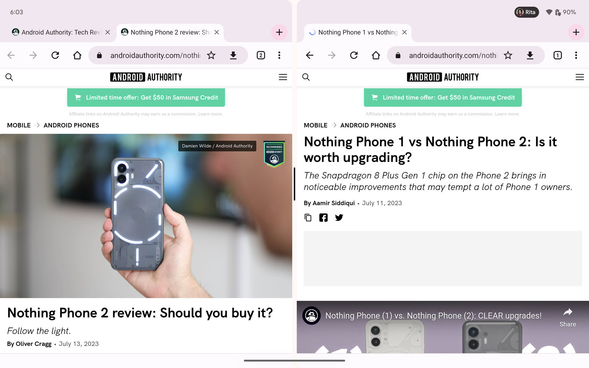
Tablets are a whole other world. This existing feature suddenly — and predictably — becomes useful on a large screen. In my month with the Pixel Tablet, I’ve found myself using multi-window at least a few times a week. Chrome with Google Maps to check out a restaurant, Wanderlog with Tiqets or GetYourGuide to plan a trip, Slack with Asana while working, Gmail with Google Drive while saving reservations, and even something as simple as WhatsApp and YouTube while chatting with friends.
It helps that the gestures to trigger the split-screen mode are easy, you can launch several instances of some apps (like Chrome to browse two websites at the same time), dragging and dropping text and images is possible, and it works in both landscape and portrait modes. Using incompatible apps like Instagram or Uber Eats is also more tolerable in split-screen mode because that wasted black space can be dedicated to another app. Plus, if I launch Chrome on the left and Maps on the right, a double tap on the separator flips them around.
My favorite productivity hack, though, is the app dock. Although the space is limited to six slots, I quickly realized I can put app folders there to speed up a bunch of actions. Something as simple as having 1Password in the dock lets me quickly check my login info for apps or websites that refuse to abide by Android’s autofill API. That’s a massive time-saver.
Landscape mode: Near useless on phones, a default on tablets
Rita El Khoury / Android Authority
The first setting I disable on any phone is auto-rotate. I don’t like seeing the screen flip and flop between orientations, especially when I’m lying in bed or on the couch. The other reason is that, outside of games and media consumption, landscape mode has become quasi-useless on today’s phones.
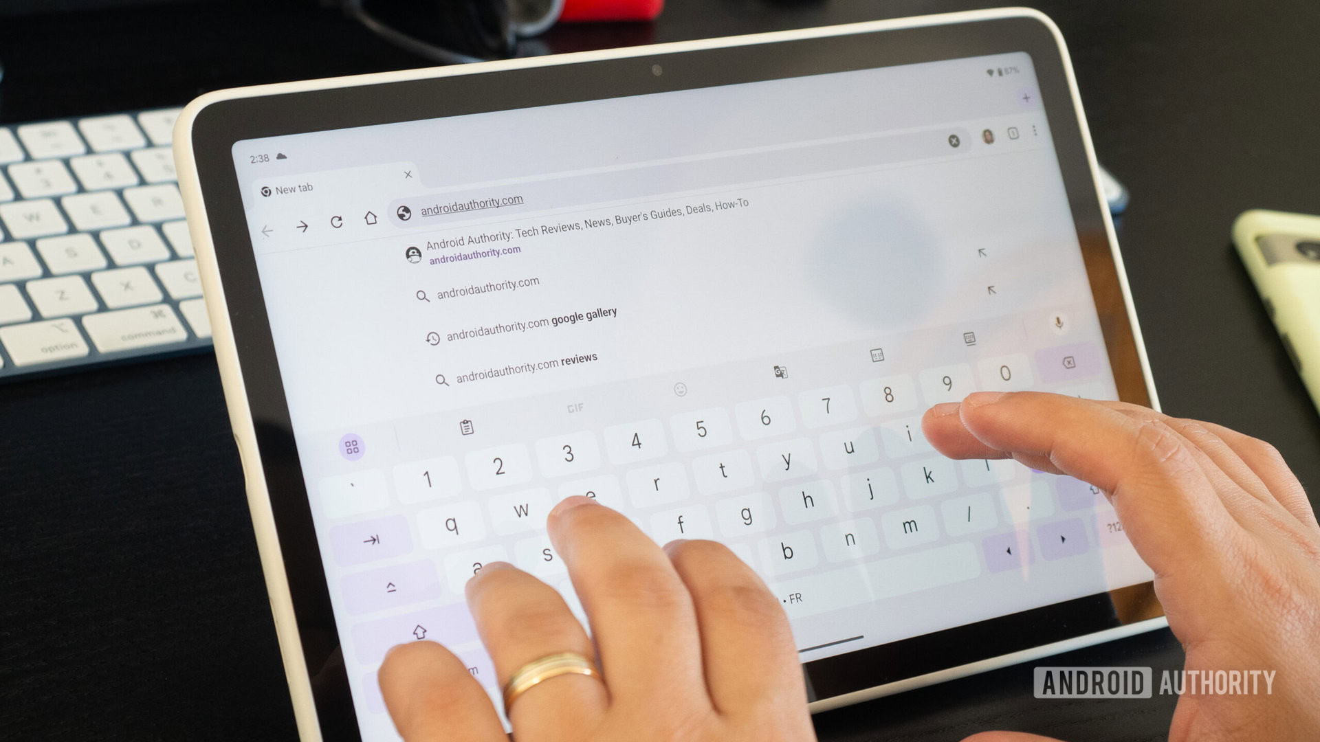
With aspect ratios of 21:9 or so, Android phones are now much narrower and taller, which means that they’re super short when you turn them sideways. Try opening Chrome in landscape mode on your phone then pop up the keyboard and all you’ll see is one line of content. Useless.
On today’s narrow and tall phone displays, landscape mode is pointless. But on tablets, there’s enough space to open the keyboard and view content.
Larger screens like those found on tablets and foldables eschew this issue. There’s enough space to display an app’s header, a decent amount of content, and a tall enough keyboard in landscape orientation — another example of a feature that’s available on our phones but that isn’t put to good use there.
Small improvements that add up
Rita El Khoury / Android Authority
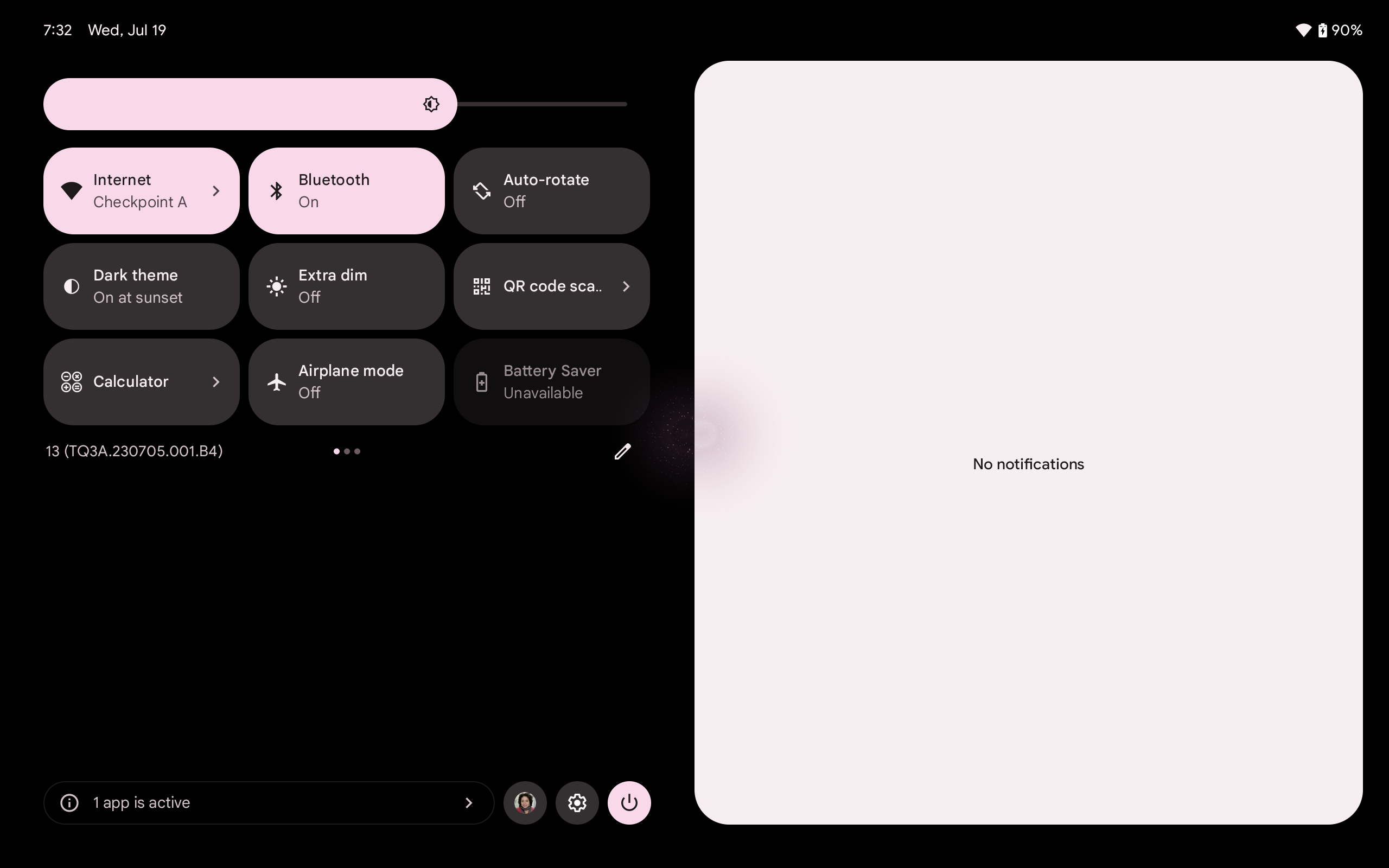
Android on large screens is very good today. So long as you’re running Android 13, whether it’s on a cheap tablet or a top-of-the-line foldable, you’re getting an excellent experience that, as I argued above, is superior to the Android experience on phones. Even the ability to see all the quick settings toggles and notifications with a single swipe is an improvement! Having more screen estate makes the entire operating system shine, features that are less useful on phones suddenly take on a new life on a tablet, and it’s just nicer to have a bigger canvas to explore apps and media content.
And with foldables slowly gaining market share, I hope we continue to see improvements and a clear commitment from Google to make this experience better and encourage third-party developers to join in.
If this is the result of two years of half-serious work from Google on tablets, imagine what we could’ve had with more than 10 years of sustained development.
Oh, I doubt Google will abandon this project, but you never know. I say this because most of us have seen the storied past of Android on tablets. This current, good state is largely due to small improvements that mostly came about with Android 12L, which launched as a developer preview less than two years ago. I’m not taking Google off the hook here for backtracking and messing up its tablet plans for more than a decade prior to 12L; I’m merely saying that if this is the result of two years of half-serious work, then imagine what we could’ve had with more than 10 years of sustained development.
For all the latest Technology News Click Here
For the latest news and updates, follow us on Google News.

