Google Android tablets finally get a Play Store designed for big screens
Google is currently working on redesigning its Play Store to better accommodate large-screen devices like the recently released Pixel Tablet.
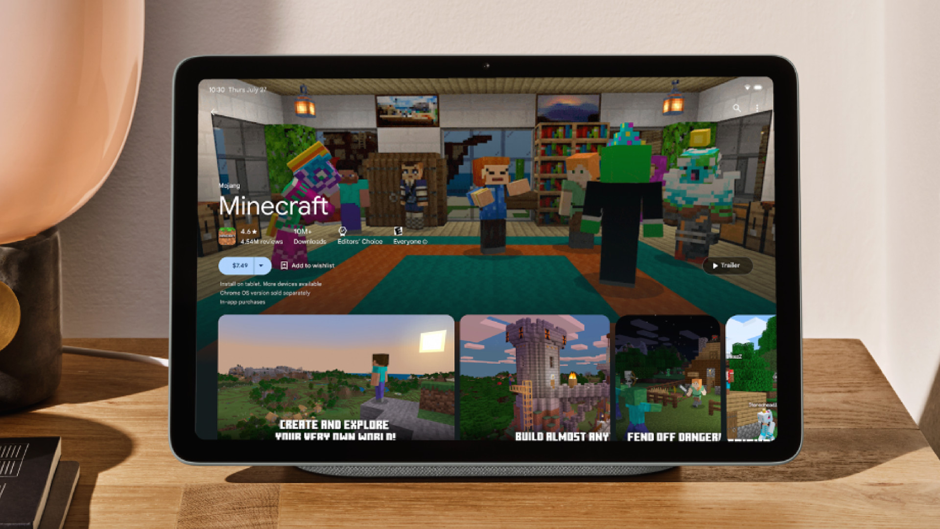
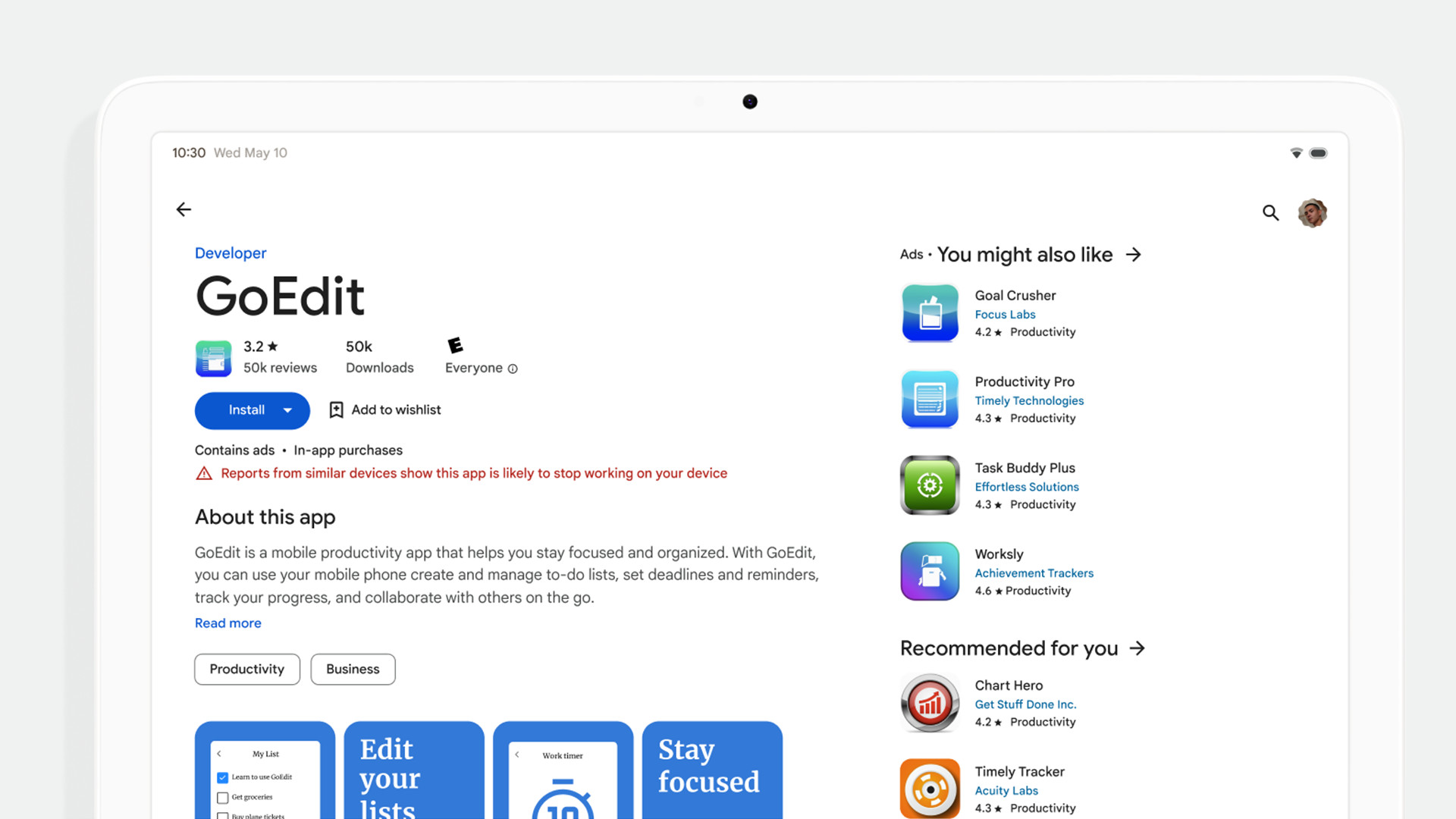
This update has been in the works for a long time ever since it was first previewed on the big screen at Google I/O 2022. Looking at the announcement post on the Android Developers Blog, the final version looks very similar to last year’s preview. Listing pages will feature a multi-column layout with the information pertaining to an app on the left and recommended software on the right. Games on the platform will have a new video banner at the top where people check out gameplay in action before downloading.

Stricter rules
Non-gaming software won’t have the banner, but developers can take advantage of the format changes to upload their own “screenshots, videos, and descriptions to display a preview”. Again, this is to help people decide whether or not they want to download the content.
There are some guidelines third-parties must adhere to. For example, images must show the actual in-app experience “focusing on the core features”.
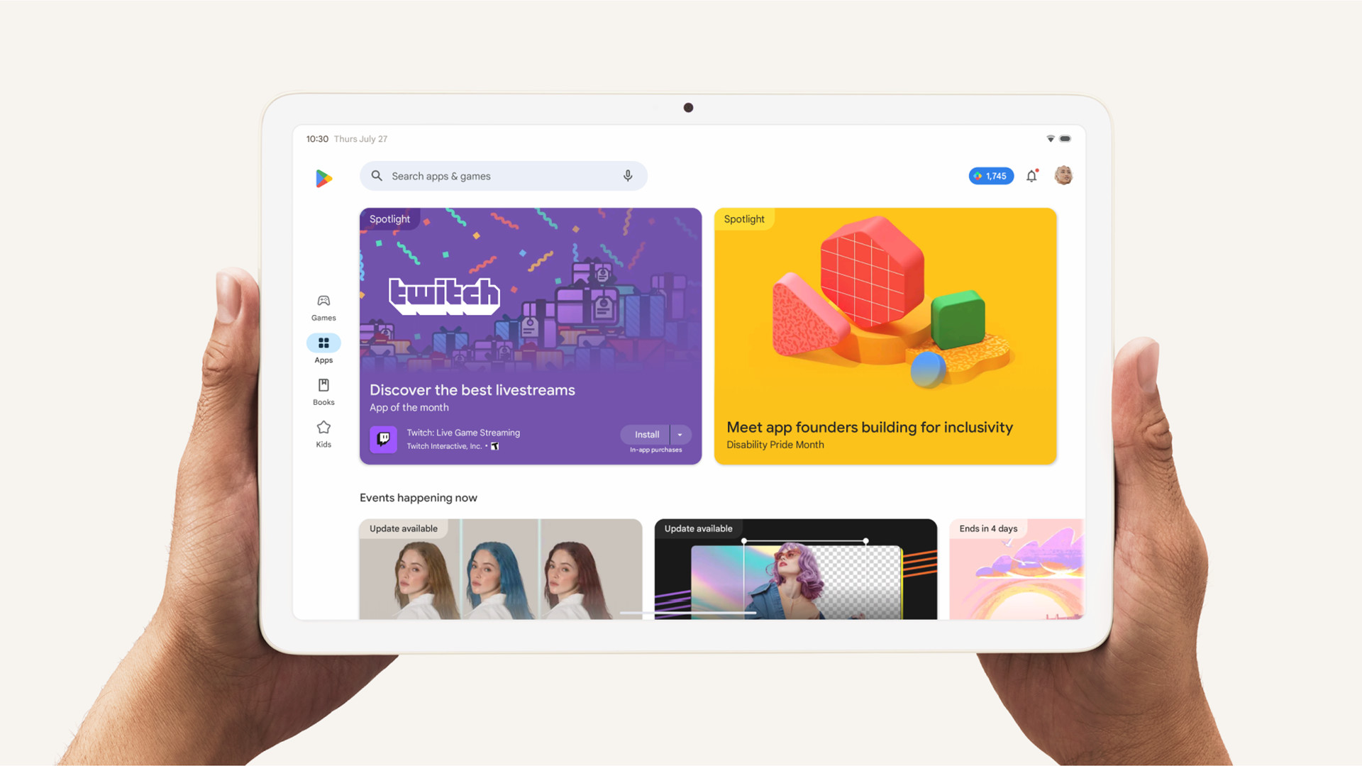
In addition to changing product layouts, Google is streamlining “store navigation”. Menu items are placed on the left-hand side so it’s easier for people’s thumbs to reach if you’re holding a tablet in landscape mode. Certain sections on the platform like Top Charts will be moved to the Apps and Games Home.

The final visual change is a split-screen search mode, putting search results on one side with the app details on the other. That way, you won’t have to jump back and forth between pages just to get the full picture. It’s all together on one screen.
Further tweaks
There’s more to the update than just looks as the company will be making some adjustments to its Play Store ranking algorithm. Google is going to be pushing third-parties into creating apps that appropriately fit bigger screens. Moving forward, software on the Play Store must have suitable portrait and landscape orientations. If a listing doesn’t follow the guidelines, those products will get penalized with reduced visibility in the Play Store plus a warning will be posted telling users this app may not work on their device.

The refresh listing pages, revamped store navigation, as well as the split-screen search “will begin rolling out over the coming weeks”. The Play Store algorithm tweaks will take a bit longer as they’ll launch in late August.
These are genuinely great changes. It is good to see Google will enforce stricter standards in maintaining app quality on its online platform. This update comes at an interesting time because we just had the second Galaxy Unpacked where Samsung revealed the ultra-wide Galaxy Z Fold 5. It feels like this foldable phone was made for the Play Store upgrade.
If you’re in the market for a new mobile device with a big screen, check out TechRadar’s list of the best foldable phones for 2023 .
For all the latest Technology News Click Here
For the latest news and updates, follow us on Google News.

