

There is one overarching theme in all the sad anniversary paeans: Steve Jobs was a visionary of the generational type and he knew how to make the complicated simple by sticking to his minimalist design ideas.
The right yellow? Yes, here’s Google’s Vic Gundotra story as a reminder about his obsession with doing things right:
Steve laughed. He said, “Vic, unless the Caller ID said ‘GOD’, you should never pick up during services”.
I laughed nervously. After all, while it was customary for Steve to call during the week upset about something, it was unusual for him to call me on Sunday and ask me to call his home. I wondered what was so important?
“So Vic, we have an urgent issue, one that I need addressed right away. I’ve already assigned someone from my team to help you, and I hope you can fix this tomorrow,” said Steve.
“I’ve been looking at the Google logo on the iPhone and I’m not happy with the icon. The second O in Google doesn’t have the right yellow gradient. It’s just wrong and I’m going to have Greg fix it tomorrow. Is that okay with you?”
iOS 15 vs Android 12, who’s minimalist now?
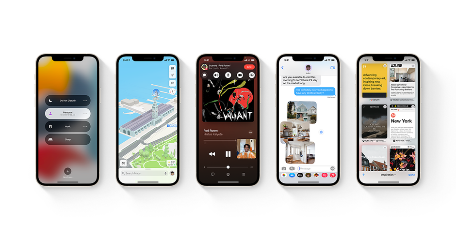
Until the last few editions, that is. As Apple keeps adding features to its phones and software to manage them, the simple row of app icons and a limited amount of settings have given way to an increasingly sophisticated iOS.
Apple iOS 15
There are now widgets, a rich control center, third-party keyboards and browsers, swipe navigation, numerous camera settings and filters to choose from, privacy permissions and perplexing automation shortcuts. While everything still moves fast and fluid under the powerful A-series processors, iOS is simple no more, and “just works” is often an afterthought.
Google’s plain Jane edition is not as feature-rich as some Android makers’ overlays but it is certainly very simple to master, use, and stare at. Just look at these jolly, easy on the eyes and finger visuals that almost seem like a kid’s drawing:
In short, there are too many options in iOS now for it to be called a minimalistic system while it’s Google that is keeping the stock Android features in its Pixels to a minimum for performance and simplicity reasons.
Was it inevitable as Apple had to keep adding features to both its now numerous iPhone models and their operating system so as to be in sync with the times?
For all the latest Technology News Click Here
For the latest news and updates, follow us on Google News.