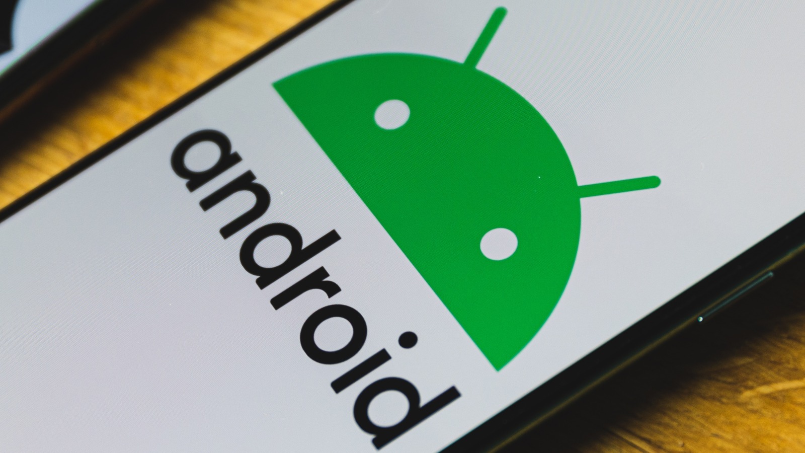
Though the new Android logo retains the same general design as the current version, it quite obviously ditches the flat aesthetic that is currently dominating product design in favor of 3D style — though one that uses a more realistic matte texture rather than the aging high-gloss variation that was common when 3D UI elements and logos first became popular.
For its part, Google told 9to5Google that this is a “new brand identity” for its mobile operating system, which has experienced a few big design changes during its time — most notably, the company’s decision to ditch food-based version names with the exit of Android 9.0 Pie. Before that, each version of Android was accompanied by a dessert name and imagery related to the sweet treat. The last major Android logo change — if you can call it that — happened in 2019 with the introduction of the flat lowercase “android” name and green robot head we know today (above).
Google hasn’t revealed when it will officially introduce the “new brand identity” and what other changes may be in the pipeline, but given that it has been teasing the 3D logo for months, it is entirely reasonable to assume that we’ll see what is in store with the arrival of Android 14.
For all the latest Gaming News Click Here
For the latest news and updates, follow us on Google News.
